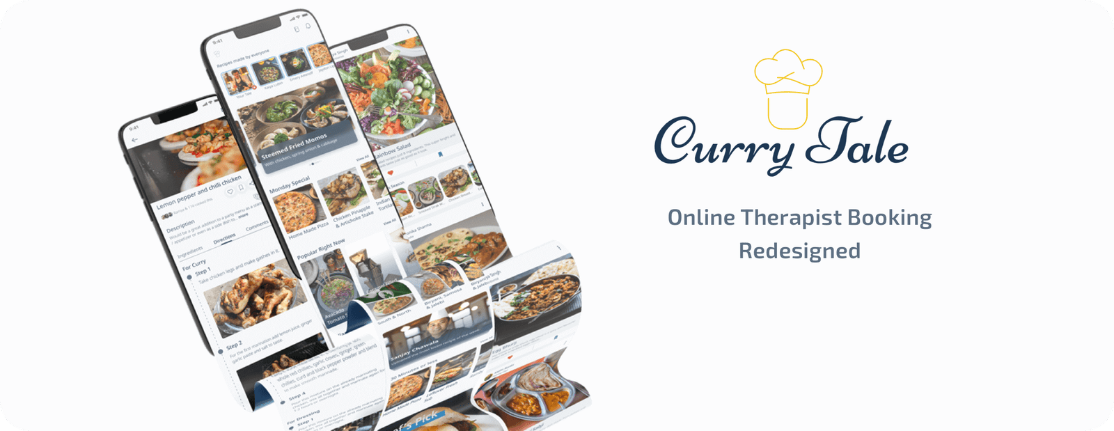
Food Recipe - A new app for new tales in your Kitchen
Most of us love to go out to enjoy good food or we crave some food that is region-specific and wonders how do they do it?
With this app, the client wanted to answer that by allowing everyone from chefs to house files to share and view recipes they love.
Brief
To create an app where users could search for recipes, the app should have a way where uploaders feel appreciated by other users in a kind of social media environment - Motivating them to share more.
They also wanted to possible ways to monetise the app helping the business grow.
Role
User Experience and Interface Designer
Tools
Figma, Zeplin, Miro, Affinity Designer, Principal
Timeline
60 Days
Problem Statment
All the recipes available out there are not validated, they don't have a connection and no way to see if known people have tried it. The client wanted to create an app that helps users share and view recipes on a single platform. There needs to be a way the uploader feel appreciated for his recipe and the user could save the recipes. The app should be clean modern and easily useable by everyone.
Process
Following the 5 stage design thinking methodology where I started with user needs, defining the users, coming out with solutions, creating the design and conducting a usability test.
Research
I started the research by interviewing people from different backgrounds. My other focus was would cook the most i.e the chief to bring in professional insights in general times it would have been hard to get the time from a chef but due to the pandemic they were happy to answer some questions, interesting insights came from culinary art students.


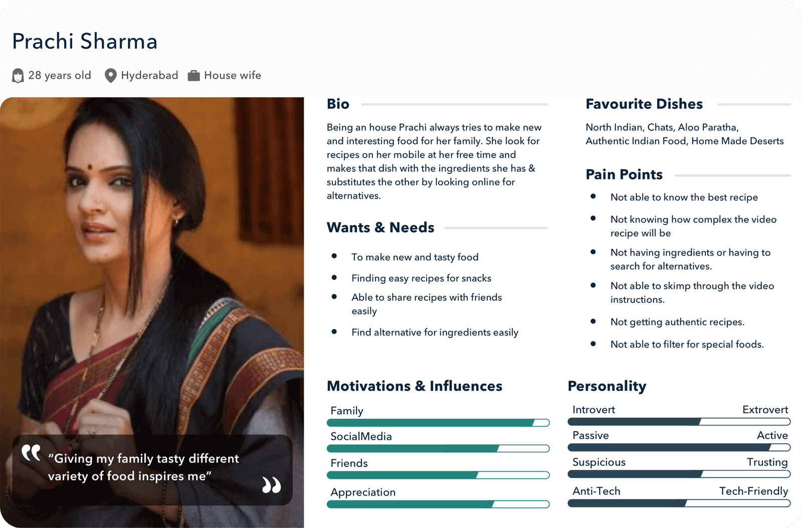
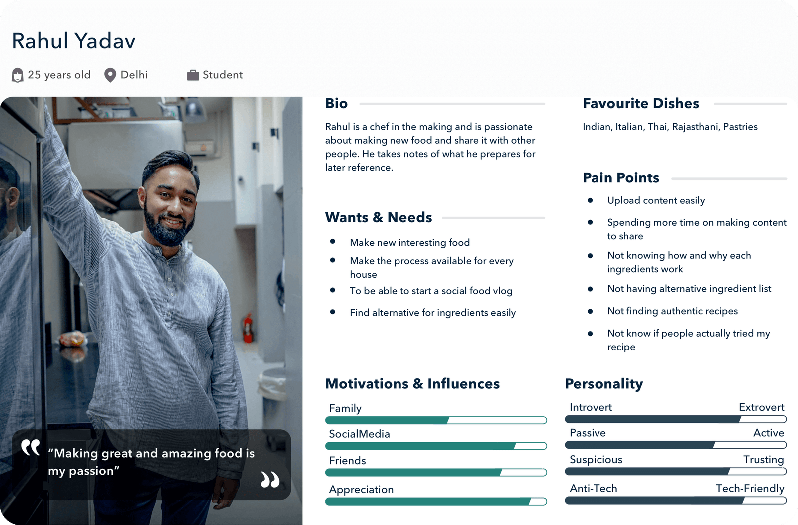
Persona
The two personas created as per the research.
User Flow
Based on the research and findings user flow was made to see if it makes a difference with the features.

Ideation
Here we all sat on a zoom call to list out features, ideas, requirements in the Miro board.
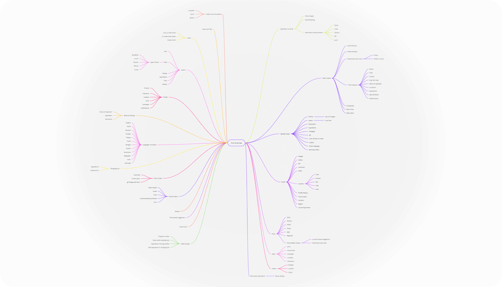
Information Architecture
The information architecture was built in such a way that the developers could easily start creating the backend system helping progress the project faster.

Proposed Solution
There were many possible solutions but we had to choose between a few options:
1. A social media like recipe app where users can view, like, comment and follow.
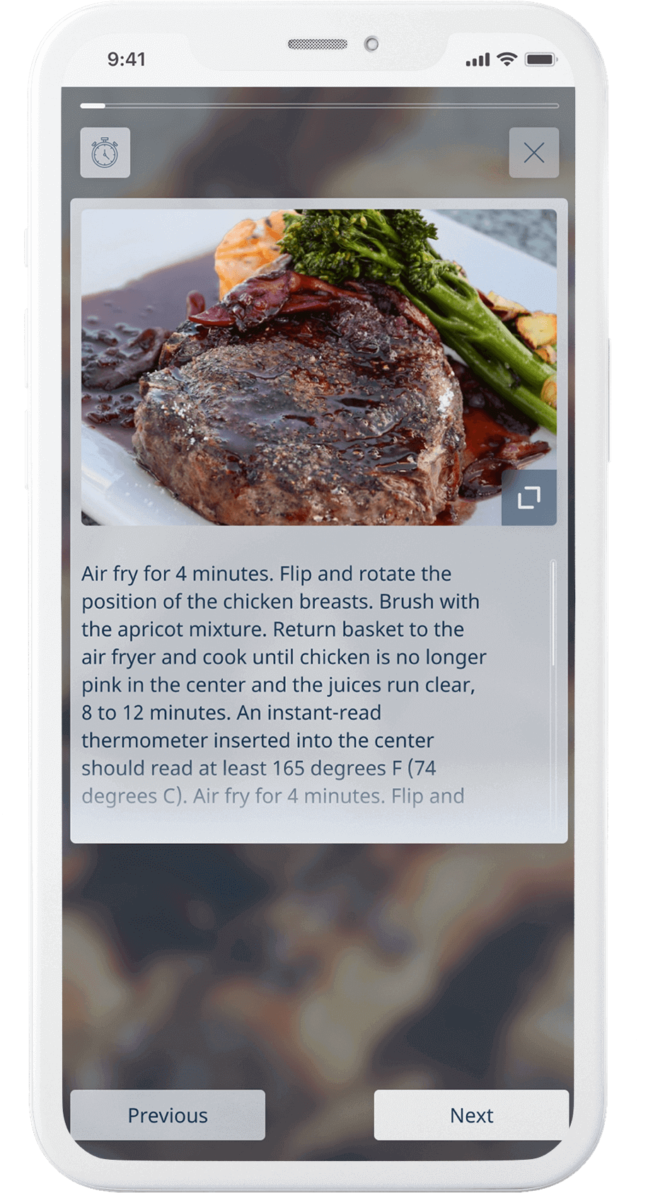
2. Feature of cook mode - made based on finding people keep shifting between recipe timer and images on how it looks at that time.
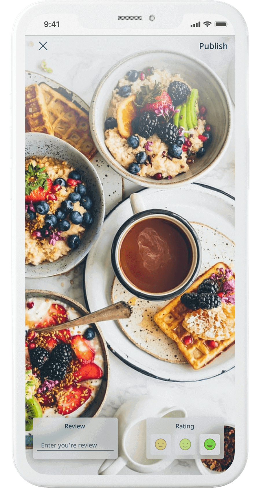
3. Feature of tales - made for giving the uploader the push for more as the other user who has tried it can go and tell which recipe they tried and how it turned out.
4. Multiple language support - as there was a need to support multiple languages the research was made to select a typeface that would support maximum languages.
5. Intuitive recipe uploader - to be designed thinking of future scalability of the app.
There were aspects kept in consideration like WCAG, Usability, Upload size, Possible Technology, chat limitation and such features.
Wireframe & Low-Fi design
As the app was to be made from scratch the wireframe process to get the correct feel of the app took some time. There were more than 3 to 4 versions of the screens maid before reaching the one that everyone liked and meets the user requirements.

Visual Design
After conducting a usability test of the initial wireframe some changes were made.
1. Users were finding it hard to upload tales
2. Users were not able to find some features which were highlighted in the second revision
The final screens were made based on the usability results and following the design guidlines by Google and Apple.

Documentation


These explanations of the features were given to the client. There were other recommendations given to improve the experience for all like:
1. Considering not all have broadband at home and will be using mobile data - first load the text and low resolution of the image than in the background load better quality.
2. The above consideration to be taken for upload also - here the upload could happen in the background.
3. As the target audience was of the lower-income area the screen design was made keeping this in mind making the design fit in the smallest device.
Takeaway
The thing that surprised me the most is that there is an open-source typeface that covers 150 of the 154 scripts defined in Unicode. While interviewing I observed many distinct traits between people who were in the cooking profession and the housewives who cook daily which helped me bring a perfect merger of features for everyone.
Next Steps
Next is to work on the video editing capability where users can upload videos recipe and perfectly time the steps. On the other side keep improving the experience of how recipes are shown and suggested as the application grows.
WOW!!! You made it to the end.
Thank you for your time.